User-Friendly Navigation Tips for Car Websites
Table of contents
- Intro
- 1. Keep Navigation Simple and Intuitive
- 2. Organise and Prioritise Key Menu Sections
- 3. Use Clear Labels, Avoid Jargon
- 4. Implement a Robust Search Function
- 5. Ensure Mobile-Friendly Navigation
- 6. Highlight Contact Info and Calls-to-Action
- 7. Use Breadcrumbs for Deep Navigation
- 8. Be Consistent and Persistent
- 9. Test and Continuously Improve
- Conclusion
Your dealership website's navigation is like a roadmap to your online showroom. If that roadmap is confusing or cluttered, visitors will leave quickly, and in a market where buyers compare multiple dealers in one session, poor navigation directly costs you enquiries.
To keep car buyers engaged and convert them into customers, your site's navigation must be intuitive, clear, and tailored to their needs. The tips below will help make your dealership website's navigation as user-friendly as possible.
3. Use Clear Labels, Avoid Jargon
Navigation labels should be in plain, customer-friendly language. Avoid dealership jargon or branded terms that might confuse users. Use "Used Cars" rather than "Pre-Owned Vehicle Portal." "Finance" is more helpful than something creative like "Dream Maker Deals." Your navigation bar is not the place for clever wordplay; it should be straightforward and descriptive.
Clear labels also help with SEO, as they signal to search engines what a page is about. Use standard terms like "Cars," "Finance," or "Contact." Keep each label short and intuitive.
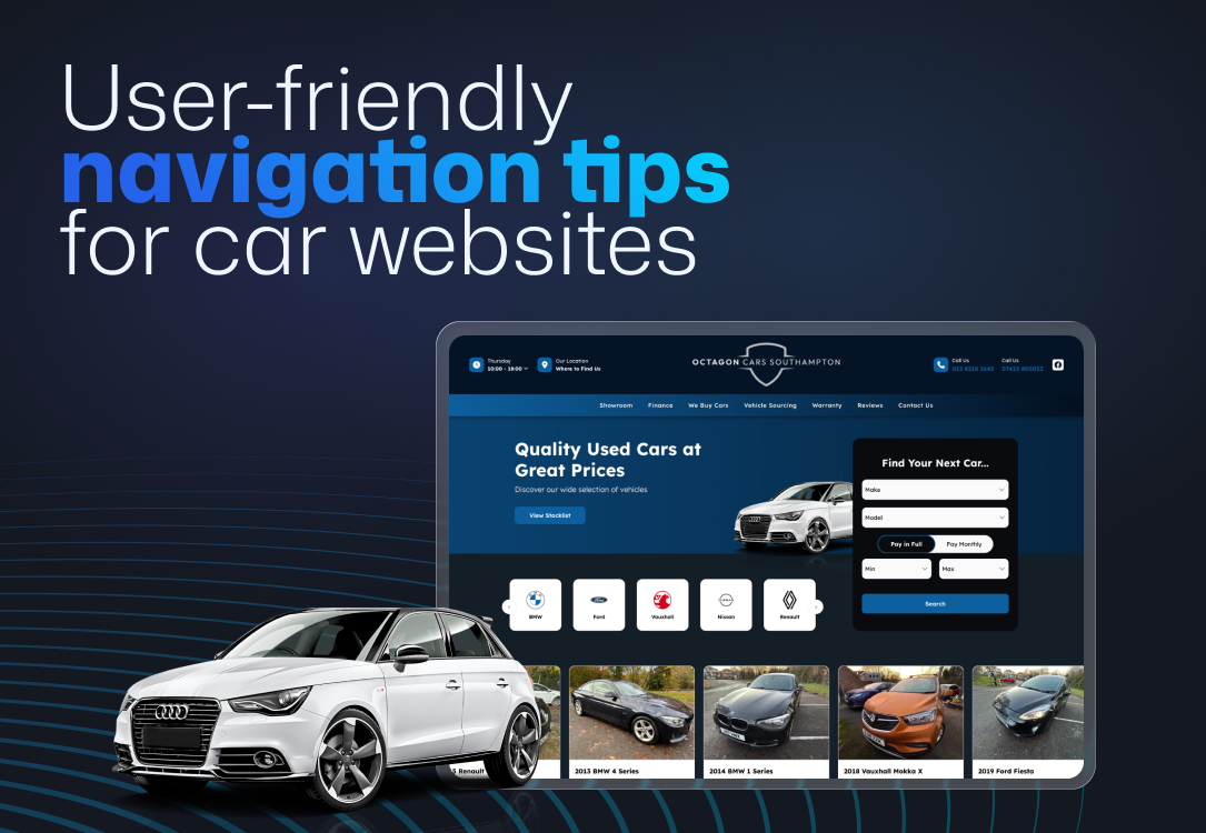
4. Implement a Robust Search Function
Not every visitor will browse through menus. Many want to search directly, especially when your stock is large. A clearly visible search bar, usually in the header, is essential. Make the search function powerful and easy to filter. Allow users to narrow results by make, model, year, price, body type, or features.
For example, someone might search for "SUVs under £15,000." With the right filters, they can find this in seconds instead of scrolling through listings. Additional filters like mileage or colour improve the experience further. A smart search tool should auto-suggest results and handle typos or synonyms gracefully.
Keep the search bar visible on every page. On mobile, this can be a simple icon in the top bar. A strong search system keeps users on your site longer.
6. Highlight Contact Info and Calls-to-Action
Make it easy for users to get in touch. Visitors with questions or ready to schedule a test drive shouldn't have to hunt for contact details. Include a clear "Contact Us" link in the header, along with a clickable phone number. If a buyer can't find your contact details quickly, there's a good chance they'll move on.
Place the phone number at the top right of every page and ensure it's clickable on mobile. Include prominent buttons for key actions like "Book a Test Drive" or "Request a Quote", styled as distinct buttons to draw attention.
Also, list your address or link to directions in a visible spot. Many buyers check your location while browsing stock. On mobile, consider a sticky footer with icons for calling, directions, and live chat. Quick access to these actions meaningfully boosts enquiry rates.
8. Be Consistent and Persistent
Navigation should remain the same across all pages. A consistent menu builds confidence and helps users learn how to get around your site. Keep your main navigation bar visible everywhere. Highlight the current page in the menu so users always know where they are.
Use a sticky navigation bar that stays at the top of the screen as users scroll, especially useful on mobile, where scrolling back to the top is a friction point. Also, use the same terminology across your site. Don't mix "Pre-Owned Vehicles" and "Used Cars" on different pages. Choose one term and stick with it.
Consistency in layout, labelling, and visibility makes navigation predictable and trustworthy.
9. Test and Continuously Improve
Navigation isn't a set-it-and-forget-it task. Review your analytics regularly to see how users interact with your site. Google Analytics can show which pages get the most clicks and where visitors drop off. If key pages like finance or part exchange are rarely visited, they may be too hidden.
Test usability by asking someone unfamiliar with your site to complete a task, find a specific car, request a quote, or book a test drive. Watch where they hesitate. You may find that labels are unclear or important links are buried.
Experiment carefully with temporary links (like seasonal promotions), but monitor their impact. Avoid cluttering the menu with extra items that push key links out of view. Every change should be guided by data and user behaviour. Keep improving over time to maintain a smooth, effective navigation system.
A car dealership website with clear, user-friendly navigation keeps visitors engaged, helps them find what they need quickly, and encourages enquiries. By keeping menus simple, focusing on what buyers care about, and ensuring a smooth mobile experience, you build trust and improve results.
If you're not sure whether your current site is working as hard as it should, that's worth investigating. Spidersnet builds car dealer websites designed specifically to turn visitors into enquiries, with intuitive navigation, fast mobile performance, and stock management built in. Take a look at what's included, or get in touch to discuss your dealership.
Treat your site like your physical showroom: make it easy to explore. Use the tips above as a checklist to audit and improve your navigation. In a competitive market, a website that's easy to use stands out and drives more leads.
Ready to transform your
dealership?
Let's chat about which package best suits your business.